
View Poll Results: Choose Your Favourite Cover
- Voters
- 19. You may not vote on this poll
-
Web of Fear Version 1
4 21.05% -
Visitation Unused Version
0 0% -
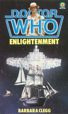
Englightenment
4 21.05% -
Curse of Peladon Version 2
5 26.32% -
Crusade Version 1
6 31.58%
Results 1 to 25 of 35
-
20th Oct 2007, 6:42 PM #1
 The Wolowitz coefficient

- Join Date
- Nov 2006
- Location
- Isle of Wight
- Posts
- 5,650
 Target Cover Competition - Group 4
The fourth group begins with another five covers, and this time round there's something a little different in there. A few unused covers have been added to this tournament and this group offers up our first one.

So that the cover underneath's image can be seen properly
-
20th Oct 2007, 6:57 PM #2
The Wolowitz coefficient
- Join Date
- Nov 2006
- Location
- Isle of Wight
- Posts
- 5,650
This was a very hard group to choose from.
I love the Web of Fear's Yeti, but Troughton's face looks wrong from below the nose and around the cheek. Overall, I do like it though.
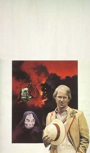
The Visitation cover looks quite good, and it's a shame that this wasn't the cover we got. The side on view of the Terileptil coming out of the fire looks good, but again, the Doctor's face is the weak point of the cover with Davison looking somewhat like a maniacal hardnut in it.
I like the Enlightenment cover. It's quite a good representation, and I remember thinking it was another photographic cover when I first saw it. I don't like the Davison image through the logo though.
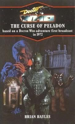
Curse of Peladon is your typical Alister Pearson mixture. There's a lot in the picture, and the representation of Pertwee looks very good. The Ice Warrior looks too much like a Dapol toy though, and unfortunately, Pearson captures rather too good a likeness of Aggedor who looks completely unscary and more like a cuddly toy.
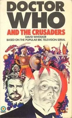
The Crusade has a great likeness of Hartnell on it, and the Julian Glover likeness isn't bad either but it is a little on the dull side.
Enlightenment gets my vote from this group.
-
20th Oct 2007, 7:50 PM #3
 Absolutely splendid!
- Join Date
- Oct 2006
- Location
- Downstairs by the PC
- Posts
- 13,267
Other than knowing that I won't be voting for the dull Enlightenment (and I never liked that Davo-in-da-logo) I'm not sure which to choose from this lot. I'll be back...
My Web of Fear has a blue logo, rather than purple though. Mm, fascinating Andrew, yes...
-
20th Oct 2007, 8:04 PM #4
The Wolowitz coefficient
- Join Date
- Nov 2006
- Location
- Isle of Wight
- Posts
- 5,650
The purple one was the original. The blue one came out in 1978 as a reprint.My Web of Fear has a blue logo, rather than purple though. Mm, fascinating Andrew, yes...
-
20th Oct 2007, 9:45 PM #5
 History Boy!

- Join Date
- Oct 2006
- Location
- Bracknell, Berks
- Posts
- 29,744
This would be a tricky round if Web of Fear wasn't one of my absolute favourite covers ever! It's a nostalgia vote this round, as that cover is one that sticks in my memory from my first visit to Bath Library to borrow Doctor Who books... lovely hardback edition it was. awww!
Technically that Curse of Peladon cover is actaully the third cover, as there was a hardback only cover done in 1980 for the book too. I like it- nice and moody Alister cover that one.
The Visitation is a good composition let down in the execution. I'm not surprised Davison turned down the chance to have that going out in book form. An interesting curio, but not much cop.
Enlightenment is great. I even like the sneaky Davison in the logo.
The Crusaders ois probably iconic too.
Strong round, but it's Web all the way for me.
Si xx
I've just got my handcuffs and my truncheon and that's enough.
-
20th Oct 2007, 10:22 PM #6
 Hmm?
Hmm?
- Join Date
- Nov 2006
- Location
- Shrewsbury
- Posts
- 5,890
Some of these covers are alright, some are just a bit bland, but 'The Web Of Fear' is simply iconic - it gets my vote.
It doesn't help that they appear to have given him a Hitler 'tache! Originally Posted by Paul Clement


-
20th Oct 2007, 11:26 PM #7

- Join Date
- Nov 2006
- Location
- Wokingham
- Posts
- 7,947
gone for The Crusaders.
-
20th Oct 2007, 11:50 PM #8Pip Madeley Guest
I find it rather interesting that The Web Of Fear is considered iconic, because I think it's a bit disappointing. For a start, the likeness to Troughton isn't particularly strong, and then there's the "web" of the title, a boringly cliched spider's web rather than the pulsating thick web referred to in the story. The reprint corrected this later, but that's another story. As for the Yeti, not a bad drawing but seeing it in full contrast takes away something for me, I think a dark brooding cover akin to the 'Abominable' Target would've been the way to go.
Anyway, as for the others, Visitation is (Davison aside) good artwork, but a little bland/empty all the same, and the surrounding bright blue border just works against it. Enlightenment also has good artwork, but Davison in the logo? God no. So it's between Curse and Crusade, and for creativity, Crusade wins. Hartnell's recognisable, Julian Glover is very recognisable, and despite it being an historical setting, it's been given an exciting spacey background with a lovely colour scheme.
-
21st Oct 2007, 12:24 AM #9Wayne Guest
Web & Crusaders get the nostalgia vote, but i like Peladon best. I'm not sure if i've ever seen that particular cover before, & apart from the cuddly Aggedor, i find it quite striking.

The others are a bit dull.
-
21st Oct 2007, 10:07 AM #10
Absolutely splendid!
- Join Date
- Oct 2006
- Location
- Downstairs by the PC
- Posts
- 13,267
Rightly or wrongly, I dearly love the Web cover - it's true that it's not a spot-on likeness of Troughton, but it's an interesting change from Achilleos' normal black & white sketches of the title characters. And although Pip's right that the web in the story is not just a web as per the cover, I think the web design on the cover is the right choice, and looks good.
The Visitation suffers, as everybody says, from the very poor drawing of Davison's face, although the rest of it is good. It's a shame nobody had the idea to have a photo of Davison on the cover (but NOT in the logo) combined with the artwork. Ah well.
Enlightenment - yawn.
The Curse of Peladon - yes, it's nicely painted but there's no excitement or inspiration there. You could do that now on paintshop and it would look just as good I expect. So although it demonstrates what an excellent artist AP is/was, it doesn't say much for his powers of composition. It's just like a dump of images - and ALSO loses points for the shocking lack of Alpha Centauri!!!
So it's The Crusaders which is gorgeous, absolutely gorgeous, with Web a very close second for me.
-
21st Oct 2007, 11:17 AM #11
 HOLISTIC DETECTIVE
- Join Date
- Nov 2006
- Location
- Valhalla.
- Posts
- 15,910
Well as much as I like Web it's boring, as is Enlightenment. The Crusaders suffers from Hartnell, A, not looking like Hartnell, B, Hartnell appearing to have a lopsided face & C, appearing to be pondering his bum. Visitation suffers from Davison looking awful, almost as if he's a look-a-like. So that leaves the atmospheric Peladon despite the cuddly monster.
Last edited by Dirk Gently; 21st Oct 2007 at 8:14 PM.

-
21st Oct 2007, 2:33 PM #12
- Join Date
- Nov 2006
- Location
- Loughton
- Posts
- 11,582
Not a bad round, but i went for Enlightenment; simple but effective.
-
23rd Oct 2007, 8:55 AM #13
 It's a game within a game
- Join Date
- Nov 2006
- Location
- Zummerzet
- Posts
- 1,523
Had to be Peladon for me, there's just so much going on! ;-)
One Day, I shall come back, Yes, I shall come back,
Until them, there must be no regrets, no tears, no anxieties, Just go forward in all your beliefs,
and prove to me that I am not mistaken in mine!
-
23rd Oct 2007, 5:43 PM #14

- Join Date
- Nov 2006
- Posts
- 280
The Crusaders is a little bit of a classic in my book. Pity about the 'Enlightenment' it seems such a great concept, but the image of ancient sailing ships racing through space could've been so much better.
-
23rd Oct 2007, 7:03 PM #15
 Who is this Davros?
- Join Date
- Nov 2006
- Location
- London, United Kingdom, United Kingdom
- Posts
- 17,652
The Crusaders is a complete bloody mess in my book! Let's plonk another Arab down over here.... and Hartnell's face looks like a cheap rubber mask!
Pity. I have no understanding of the word. It is not registered in my vocabulary bank. EXTERMINATE!
-
23rd Oct 2007, 11:05 PM #16

- Join Date
- Nov 2006
- Location
- Glasgow
- Posts
- 5,954
I remember that Crusaders cover - I think it was about the third target. For me though the best cover is easily Peladon

-
24th Oct 2007, 7:57 AM #17
History Boy!
- Join Date
- Oct 2006
- Location
- Bracknell, Berks
- Posts
- 29,744
No! Come on we can't lose my favourite Target cover yet! Vote for Web of Fear people!
Si xx
I've just got my handcuffs and my truncheon and that's enough.
-
25th Oct 2007, 2:49 PM #18
- Join Date
- Nov 2006
- Location
- Loughton
- Posts
- 11,582
He often wore them - he didn't want people finding out he was really Maureen Tattersall of Putney. Originally Posted by Rob McCow
-
25th Oct 2007, 6:47 PM #19Pip Madeley Guest
Maybe he went to Mike Saville's Tension. Originally Posted by Rob McCow

-
25th Oct 2007, 9:03 PM #20Wayne Guest
Same here. I didn't like it though. I thought the historicals were dull even back then, & technically this was my first one! Originally Posted by Ralph

I vaguely remember swapping it at school. Can't remember what i exchanged it for though.
-
25th Oct 2007, 10:25 PM #21
Hmm?
- Join Date
- Nov 2006
- Location
- Shrewsbury
- Posts
- 5,890
You swapped it for a guitar and you've never looked back since. Originally Posted by Wayne

-
25th Oct 2007, 10:27 PM #22Pip Madeley Guest
Must've been one of those home-made ones with elastic bands.
-
25th Oct 2007, 11:19 PM #23Wayne Guest
I probably swapped it for a Fiesta or Knave from my mate who's Dad had a newsagent.
Last edited by Wayne; 25th Oct 2007 at 11:57 PM. Reason: typo
-
25th Oct 2007, 11:34 PM #24Pip Madeley Guest
What's a Kave, Grandad?
-
25th Oct 2007, 11:58 PM #25Wayne Guest
It's the reason i edited my post, my boy. Originally Posted by Pip Madeley


Similar Threads
-
Target Cover Competition - Group 30
By Paul Clement in forum The Fiction FactoryReplies: 17Last Post: 26th Aug 2008, 5:43 PM -
Target Cover Competition - Group 13
By Paul Clement in forum The Fiction FactoryReplies: 15Last Post: 16th Jan 2008, 6:16 PM -
Target Cover Competition - Group 12
By Paul Clement in forum The Fiction FactoryReplies: 12Last Post: 29th Dec 2007, 4:20 PM -
Target Cover Competition: Group 11
By Paul Clement in forum The Fiction FactoryReplies: 15Last Post: 19th Dec 2007, 7:24 PM -
Target Cover Competition - Group 10
By Paul Clement in forum The Fiction FactoryReplies: 16Last Post: 12th Dec 2007, 12:05 AM


PSAudios 6.1. Bless You Doctor Who
[/URL] (Click for large version) Doctor Who A thrilling two-part adventure starring Brendan Jones & Paul Monk & Paul Monk Bless You,...
23rd Nov 2020, 3:02 PM