View Poll Results: Choose Your Favourite Cover
- Voters
- 15. You may not vote on this poll
-
Sensorites
1 6.67% -
Reign of Terror
7 46.67% -
Earthshock Version 1
0 0% -
Caves of Androzani Version 1
4 26.67% -
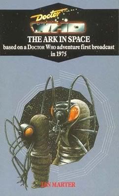
Ark in Space Version 2
3 20.00%
Results 1 to 13 of 13
-
23rd Dec 2007, 5:19 PM #1

 The Wolowitz coefficient

- Join Date
- Nov 2006
- Location
- Isle of Wight
- Posts
- 5,650
 Target Cover Competition - Group 12

-
23rd Dec 2007, 6:48 PM #2
 HOLISTIC DETECTIVE
- Join Date
- Nov 2006
- Location
- Valhalla.
- Posts
- 15,910
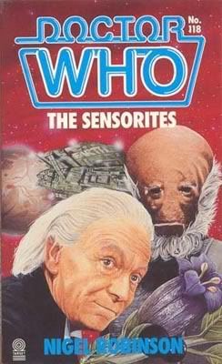
This for me is between The Sensorites & The Reign of Terror.
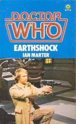
Caves of Androzani & Ark in Space are boring & Earthshock is just lazy!
So, The Sensorites seems cluttered & The Reign of Terror is just a single picture which is really good art work & gets my vote.
-
23rd Dec 2007, 9:45 PM #3
 Who is this Davros?

- Join Date
- Nov 2006
- Location
- London, United Kingdom, United Kingdom
- Posts
- 17,652
The Ark In Space is quite cool, I especially like the way its design matches the Revenge of The Cybermen re-issue.
Pity. I have no understanding of the word. It is not registered in my vocabulary bank. EXTERMINATE!
-
23rd Dec 2007, 10:32 PM #4
 History Boy!
- Join Date
- Oct 2006
- Location
- Bracknell, Berks
- Posts
- 29,744
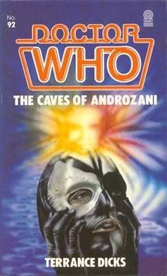
It's Caves of Androzani for me. I think Skilleter hit his peak with the season 21 covers and this one is especially good.
The others are ok. The two Hartnells are fine paintings, but rather dull, the Earthshock one, well what can you say really and The Ark in Space is rather nice.
Si xx
I've just got my handcuffs and my truncheon and that's enough.
-
23rd Dec 2007, 11:00 PM #5

- Join Date
- Nov 2006
- Location
- Wokingham
- Posts
- 7,947
thinl they are all pretty awful to be honest but Reign of Terror , is at least carches the eye.
-
23rd Dec 2007, 11:03 PM #6Pip Madeley Guest
Ark In Space is stylish, the rest are so 80s/garish/old-fashioned (delete as applicable).
-
24th Dec 2007, 12:27 AM #7
 Absolutely splendid!
- Join Date
- Oct 2006
- Location
- Downstairs by the PC
- Posts
- 13,267
Euch, they're all pretty stinky. I think the least dreadful is the one for Androzani. Just to elaborate:
The Sensorites is too cluttered, and the ship looks just wrong.
The Reign of Terror is a nice idea for a composition, but is very poorly done. The figures all look odd to me.
Earthshock is another less-than-inspiring photo, and choosing one of the Doctor with a gun (rather than, say, A CYBERMAN!!!) is pretty daft.
And The Ark in Space shows the Wirrrn's feet for goodness sakes. If the director wisely pointed his camera away from them, don't bloody paint them on the cover of the book!!!!
-
24th Dec 2007, 1:05 AM #8
The Wolowitz coefficient
- Join Date
- Nov 2006
- Location
- Isle of Wight
- Posts
- 5,650
Sensorites is quite a good cover, though as Andrew mentioned, a little cluttered. Hartnell is pretty well captured, and it's good to see the Sensorites on the cover.
Reign of Terror encapsulates the story extremely well, and has a good likeness of Hartnell to enhance a great bit of artwork.
Earthshock is the most dramatic of the photo covers and it's definitely the only one that I like, but it's still weaker than most of the other covers in the range.
I like Caves of Androzano a lot. The regeneration swirl above Sharaz Jek's head looks a bit odd, but it's bold and colourful.
Ark in Space is the worst of the five, and reiterates what an awful artist Pearson generally was with the reprints. It's absolutely dull and the Wirrn in the foreground looks completely ridiculous.
Reign of Terror just pips Caves of Androzani for my vote, but I'd be happy to see either of these, or Sensorites get through.
-
26th Dec 2007, 10:01 PM #9
 Hmm?
Hmm?
- Join Date
- Nov 2006
- Location
- Shrewsbury
- Posts
- 5,890
Apart from The Sensorites, they're all fairly good in their own way - yes, even Earthshock, which I was tempted to go for for nostalgic reasons. However, none are more than 'fairly good', but at least 'The Reign Of Terror' is faintly dramatic, and I quite like the artist's (Tony Masero?) style here, so that gets my vote.
-
27th Dec 2007, 10:53 AM #10
 It's a game within a game
- Join Date
- Nov 2006
- Location
- Zummerzet
- Posts
- 1,523
Androzani sums up Sharaz Jek's inner turmoil for me, with a hint of Colin Baker thrown in for good measure!
One Day, I shall come back, Yes, I shall come back,
Until them, there must be no regrets, no tears, no anxieties, Just go forward in all your beliefs,
and prove to me that I am not mistaken in mine!
-
27th Dec 2007, 11:44 PM #11Wayne Guest
Ark pips Caves. The rest are rubbish.

-
29th Dec 2007, 4:08 PM #12
- Join Date
- Nov 2006
- Location
- Loughton
- Posts
- 11,582
I quite like The Sensorites. I quite like the rest actually, but Sensorites is the one i like most.
-
29th Dec 2007, 4:20 PM #13
 B7 @ 40
- Join Date
- Nov 2006
- Location
- London
- Posts
- 3,166
I like both the Hartnells and have gone with Reign - I like the Doc's outfit, the guillotine and the raised arms of the crowd. A reminder that it's not all sci-fi glitz!
The other three are pretty poor, though Earthshock was probably my favourite photographic cover.


Similar Threads
-
Target Cover Competition - Group 30
By Paul Clement in forum The Fiction FactoryReplies: 17Last Post: 26th Aug 2008, 5:43 PM -
Target Cover Competition - Group 13
By Paul Clement in forum The Fiction FactoryReplies: 15Last Post: 16th Jan 2008, 6:16 PM -
Target Cover Competition: Group 11
By Paul Clement in forum The Fiction FactoryReplies: 15Last Post: 19th Dec 2007, 7:24 PM -
Target Cover Competition - Group 10
By Paul Clement in forum The Fiction FactoryReplies: 16Last Post: 12th Dec 2007, 12:05 AM -
Target Cover Competition - Group 9
By Paul Clement in forum The Fiction FactoryReplies: 15Last Post: 1st Dec 2007, 3:09 PM


PSAudios 6.1. Bless You Doctor Who
[/URL] (Click for large version) Doctor Who A thrilling two-part adventure starring Brendan Jones & Paul Monk & Paul Monk Bless You,...
23rd Nov 2020, 3:02 PM