
Thread: Bored Man Redesigns Tube Map
Results 1 to 24 of 24
-
28th Jun 2011, 1:53 PM #1

 Together Through Life

- Join Date
- Oct 2006
- Location
- Sawbridgeworth
- Posts
- 25,127
 Bored Man Redesigns Tube Map
And here it is...A man is attempting to change travel history after unveiling his own updated version of the iconic London Underground map.
Bored Man Redesigns Tube Map
And here it is...A man is attempting to change travel history after unveiling his own updated version of the iconic London Underground map.
British designer Mark Noad has redesigned Harry Beck’s 1931 classic version to show the routes and distances between all London stations in a more geographically accurate way.
According to Mr Noad, the map has nothing to do with Transport for London (TFL) but he has designed it in a way that still retains the clarity of the original.
Explaining some of the changes on his project website, the major alterations include changing Beck’s 45-degree angles into 30- and 60-degree ones to shorten the extremities of the lines to make it more compact.
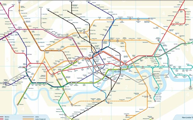
It looks horrible.
So is it better to have a map that's slightly more accurate or a lot easier to read?
Or perhaps you like it?
Si.
-
28th Jun 2011, 2:43 PM #2
 Sunshine Playroom
- Join Date
- Nov 2006
- Location
- Airstrip One
- Posts
- 4,760
I'd heard about this before, I think it's more to do with saving wasted journeys on short stops when you could walk, rather than the guy simply being bored.

It actually doesn't look as bad as I feared it might.If my sons did not want wars, there would be none. - Gutle Schnaper Rothschild
-
28th Jun 2011, 4:13 PM #3
 History Boy!

- Join Date
- Oct 2006
- Location
- Bracknell, Berks
- Posts
- 29,744
The original is a design classic, this isn't.
However, I can see it has some uses- it's often difficult to deduce how far away stations are from one another, so this could be a useful addition, as long as it doesn't replace the original one.
-
28th Jun 2011, 4:51 PM #4
Together Through Life
- Join Date
- Oct 2006
- Location
- Sawbridgeworth
- Posts
- 25,127
I think the trouble is that people are more interested in which stations are on which line than how far apart they are. So if you include actual distances then it prevents you from being able to see at once glance all the stations in a certain radius. It seems awfully difficult to take in a view of the central line in one glance on this map.
Si.
-
28th Jun 2011, 9:09 PM #5

- Join Date
- May 2010
- Posts
- 791
No tube map is better than this.
-
29th Jun 2011, 12:10 AM #6
 aka aggix
- Join Date
- Nov 2006
- Location
- London
- Posts
- 4,128
Funnily enough I was only thinking about this a couple of weeks ago, and found a map online where someone had taken a google earth shot of London and added all the tube lines to it.
I really love the new version, I'm not quite sure why but it makes London seem bigger and more exciting, as it sprawls all over the place, which appeals, but I'm obviously alone on this! I do like the idea behind it too, when I first started visiting London in my fairly early teens I'd go to Oxford Street, go around the shops, and then head back to the station before catching a tube to picadilly - when I finally found out how close the two stations were (and the delights of Soho in the middle!) I felt pretty stupid."RIP Henchman No.24."
-
29th Jun 2011, 12:38 AM #7
 Who's Laughing Now?
- Join Date
- May 2009
- Location
- Way under, down under.
- Posts
- 4,067
I think this was how they originally did the London underground maps - but the circuit diagram version we've got is just brilliant. It's a case of simplifying the information so "some reality is lost", however it's so much easier to read and use.
Oddly enough we were talking about it in a test forum about "simplifying our documentation stream".Remember, just because Davros is dead doesn't mean the Dalek menace has been contained ......
-
29th Jun 2011, 10:11 AM #8

- Join Date
- Nov 2006
- Location
- Sittingbourne, Kent, UK
- Posts
- 2,403
Personally I rather like it. It's still obviously stylised, but if it includes more accurate distance information it becomes slightly more useful. The original is a design classic, and its use of horizontal, vertical or 45 degree lines only makes it easy on the eye, but I can't see that map being any harder to use.
Isn't that the point, though? All the stations in a certain radius are more precisely rendered on this map, since the 'certain radius' on the original bears little resemblance to the actual distance.So if you include actual distances then it prevents you from being able to see at once glance all the stations in a certain radius.
If you were making a journey on one line only I'd agree this map has little advantage over the orniginal. However, if your journey requires changing from line to line, then yes, I'd like to know which route is shorter.
-
29th Jun 2011, 10:17 AM #9
 Who is this Davros?
- Join Date
- Nov 2006
- Location
- London, United Kingdom, United Kingdom
- Posts
- 17,652
There's far too much distance between Victoria and Green Park! And it doesn't tell you about the ten minute walk between the different lines at Green Park either. Useless with a capital city!
-
29th Jun 2011, 10:31 AM #10
 Tickets and passes please.....
- Join Date
- Nov 2006
- Location
- London, United Kingdom, United Kingdom
- Posts
- 3,196
As I work on London Underground this new map is pointless and very difficult to read. The current map, I admit, doesn't reflect short distances between stations but is very clear to read.
Im being extremely clever up here and theres no one to stand around looking impressed! Whats the point in having you all?
-
29th Jun 2011, 11:56 AM #11
Who's Laughing Now?
- Join Date
- May 2009
- Location
- Way under, down under.
- Posts
- 4,067
We had an interesting discussion on the Underground map a couple of months ago, and how to some extent it sacrifices accuracy (showing distance etc) for usability. It's a fascinating concept, and one we're trying to use more at work, trying to display more information on an intuitive pictorial level, even though we know it's not quite as accurate and in-depth.
Remember, just because Davros is dead doesn't mean the Dalek menace has been contained ......
-
29th Jun 2011, 12:09 PM #12
Who is this Davros?
- Join Date
- Nov 2006
- Location
- London, United Kingdom, United Kingdom
- Posts
- 17,652
What a fascinating idea... to hold in my hand a piece of paper that mapped... everything! To know that the power of unlimited travel around London was mine and mine alone.... Yes... Yes! I would do it! That power would set me up above the gods! AND THROUGH THE TUBE MAP, I SHALL HAVE THAT POWER!!It's a fascinating concept
-
29th Jun 2011, 12:14 PM #13
 Que?
Que?
- Join Date
- Nov 2006
- Location
- Torquay
- Posts
- 4,613

(You know we were all reading it in that voice... )
)
-
29th Jun 2011, 1:19 PM #14
 Roger Delgado Fan
- Join Date
- Jan 2007
- Location
- UK
- Posts
- 411
 Originally Posted by Rob McCow

Eeeek quick run for them there hills
 'Steed is one of my most valuable subjects he's too valuable to lose'
-
29th Jun 2011, 1:47 PM #15
 TARDIS, Matt and Ood
- Join Date
- Oct 2006
- Location
- Surrey
- Posts
- 5,822
I think its horrible. Every time I see it I just tip my head to the left to view it.
-
30th Jun 2011, 8:53 AM #16

- Join Date
- Nov 2006
- Location
- UK
- Posts
- 764
I think it's hideous. Perhaps because I have used the official one for such a long time and can find the stations I need so easily, this new one looks like a horrible distortion.
Why build an engine when you have a perfectly good whale?
-
30th Jun 2011, 11:09 AM #17
 Double Trouble!
- Join Date
- Nov 2006
- Location
- Whitton
- Posts
- 1,880
I'm with you on that one. I do the 'Green Park Corridor line' on a daily basis. It's like an on-foot version of the Waterloo & City Line only this time with Green Park (Victoria Line) on one end and Green Park (Piccadilly Line) on the other!!! Originally Posted by Rob McCow

-
30th Jun 2011, 12:21 PM #18
Que?
- Join Date
- Nov 2006
- Location
- Torquay
- Posts
- 4,613
I've done the Green Park walk many times and agree that it's a very tenuous 'interchange'!
The alternative map is clever but far too cluttered for me. The classic Beck diagram gets it all just right, apart from the geography, obviously, but then it was never intended to be a map in the true sense.
-
30th Jun 2011, 12:24 PM #19
Tickets and passes please.....
- Join Date
- Nov 2006
- Location
- London, United Kingdom, United Kingdom
- Posts
- 3,196
With all that travelling on public transport, we have to help you keep fit somehow.
Im being extremely clever up here and theres no one to stand around looking impressed! Whats the point in having you all?
-
30th Jun 2011, 2:19 PM #20
 Moderator

- Join Date
- Oct 2006
- Location
- Atlanta, GA
- Posts
- 4,996
I used to find that it was actually faster to go up to the ticket hall and back down the escalator when changing lines(!) Originally Posted by Ian Lethbridge-Stewart
Watchers in the Fourth Dimension: A Doctor Who Podcast
Three Americans and a Brit attempt to watch their way through the entirety of Doctor Who
----
Latest Episode: The WOTAN Clan, discussing The War Machines
Available on iTunes, Spotify, Stitcher, and Podbean
Follow us on Facebook, Instagram, and Twitter at @watchers4d
-
30th Jun 2011, 4:25 PM #21
- Join Date
- Nov 2006
- Location
- Loughton
- Posts
- 11,582
No tube map is better than this.Dammit - they're onto me at last!2011/06/02
403 notes
While the Doctor might well be best known for fighting intergalactic aliens, much of his time is taken up with the day to day protection of the Central Line from extraterrestrial interference. It has come to light however that when trains pass too close to the Tardis there is a chance they may not end up at Woodfood (via Hainault).
This map reminds me of the way it looked around WWII - it was a little more true to life due to there being less lines.
-
30th Jun 2011, 5:00 PM #22
Moderator
- Join Date
- Oct 2006
- Location
- Atlanta, GA
- Posts
- 4,996
For the sake of comparison, here's the tube map c. 1945: Originally Posted by Stuart Wallis

Watchers in the Fourth Dimension: A Doctor Who Podcast
Three Americans and a Brit attempt to watch their way through the entirety of Doctor Who
----
Latest Episode: The WOTAN Clan, discussing The War Machines
Available on iTunes, Spotify, Stitcher, and Podbean
Follow us on Facebook, Instagram, and Twitter at @watchers4d
-
3rd Jul 2011, 6:57 PM #23
- Join Date
- Nov 2006
- Posts
- 2,993
Having looked at the two side-by-side, I'd say you'd have to be a Londoner and familiar with the original map to think that this one is any harder to read. Yes, it's not quite as "pretty", but it's just as clear, it's just that you've already got the original burned into your brain so find it easier to navigate around it.

-
4th Jul 2011, 4:12 PM #24

- Join Date
- Nov 2006
- Location
- Glasgow
- Posts
- 5,954
Well I for one think it's a fabulous map and I think it should be put in every underground station and train with immediate effect!


Similar Threads
-
Tube strike: London Underground action disrupts commuters
By Philipnet in forum News and SportReplies: 32Last Post: 14th Apr 2016, 11:50 AM -
You Tube Copy-Me-Don'ts!
By Rob McCow in forum Mr Smith, I Need You!Replies: 1Last Post: 25th Oct 2008, 7:05 PM -
Tube Strike Menace - Londoners Flee!
By Rob McCow in forum General ForumReplies: 19Last Post: 5th Sep 2007, 9:20 AM


PSAudios 6.1. Bless You Doctor Who
[/URL] (Click for large version) Doctor Who A thrilling two-part adventure starring Brendan Jones & Paul Monk & Paul Monk Bless You,...
23rd Nov 2020, 3:02 PM