
Thread: Your favourite VHS covers
Results 1 to 14 of 14
-
22nd Mar 2012, 2:30 PM #1

 Moderator

- Join Date
- Oct 2006
- Location
- Atlanta, GA
- Posts
- 4,996
 Your favourite VHS covers
Unlike the DVD range, the old VHS range had some absolutely fantastic artwork. So, I ask you... what were your favourites of the range?
Here are some of mine:


I've shown you mine... now show me yours!
Watchers in the Fourth Dimension: A Doctor Who Podcast
Three Americans and a Brit attempt to watch their way through the entirety of Doctor Who
----
Latest Episode: The WOTAN Clan, discussing The War Machines
Available on iTunes, Spotify, Stitcher, and Podbean
Follow us on Facebook, Instagram, and Twitter at @watchers4d
-
23rd Mar 2012, 8:04 AM #2
 Who is this Davros?

- Join Date
- Nov 2006
- Location
- London, United Kingdom, United Kingdom
- Posts
- 17,652
I did love the VHS covers. They're the main reason that the videos are still all up in the loft! It's a shame they moved over to Photoshop in the end, but kind of inevitable.
An Unearthly Child was my favourite VHS cover, with it's Queen-The-Miracle inspired merging of the Doctor and Susan's faces.Pity. I have no understanding of the word. It is not registered in my vocabulary bank. EXTERMINATE!
-
23rd Mar 2012, 9:19 AM #3
 Together Through Life

- Join Date
- Oct 2006
- Location
- Sawbridgeworth
- Posts
- 25,127
Great choices Ant, I love the Planet of the Spiders cover it's possibly my favourite Doctor Who artwork of all time!
How about this as the worst?

Peter Davison's disembodied head with an oddly small face, Lynda Barron chewing a wasp and a horrid grey sailing ship. It honks.
Si.
-
23rd Mar 2012, 9:57 AM #4

- Join Date
- Feb 2009
- Posts
- 269
I actually like the Enlightenment cover. It's Terminus which is dreadful, as though it was done by a child, another example being Image of the Fendahl. (Others I dislike include The Masque of Mandragora, The Three Doctors and Bruno Elettori's covers.)
Back to favourite covers:


-
23rd Mar 2012, 10:03 AM #5
 History Boy!
- Join Date
- Oct 2006
- Location
- Bracknell, Berks
- Posts
- 29,744
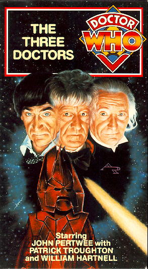
I really like The Three Doctors:
And for a late one...


I've just got my handcuffs and my truncheon and that's enough.
-
23rd Mar 2012, 10:07 AM #6
Together Through Life
- Join Date
- Oct 2006
- Location
- Sawbridgeworth
- Posts
- 25,127
I've always been bothered by the fact that "The Three Doctors" should have Omega in the middle to be symmetrical, but instead he's nudged to one side and sharing the limelight with that star of the story, the light stream.
Si.
-
23rd Mar 2012, 10:12 AM #7
History Boy!
- Join Date
- Oct 2006
- Location
- Bracknell, Berks
- Posts
- 29,744
Surely this is the worst VHS cover...

I've just got my handcuffs and my truncheon and that's enough.
-
23rd Mar 2012, 11:16 AM #8
Together Through Life
- Join Date
- Oct 2006
- Location
- Sawbridgeworth
- Posts
- 25,127
I love the inclusion of Dora Bryan though.
Si.
-
23rd Mar 2012, 12:29 PM #9
Moderator
- Join Date
- Oct 2006
- Location
- Atlanta, GA
- Posts
- 4,996
I'm not so sure about Enlightenment being the absolute worst... here are some pretty shocking ones:


The former is obvious - wrong logo, wrong version of the Doctor, wrong Cybermen...
The latter, on the other hand... what's wrong with Tom's face!?
Watchers in the Fourth Dimension: A Doctor Who Podcast
Three Americans and a Brit attempt to watch their way through the entirety of Doctor Who
----
Latest Episode: The WOTAN Clan, discussing The War Machines
Available on iTunes, Spotify, Stitcher, and Podbean
Follow us on Facebook, Instagram, and Twitter at @watchers4d
-
23rd Mar 2012, 12:30 PM #10
History Boy!
- Join Date
- Oct 2006
- Location
- Bracknell, Berks
- Posts
- 29,744
Does the logo matter? It was the current one at the time- and more would be wrong by using the Diamond logo or the TVM one!!
I've just got my handcuffs and my truncheon and that's enough.
-
23rd Mar 2012, 12:31 PM #11
Moderator
- Join Date
- Oct 2006
- Location
- Atlanta, GA
- Posts
- 4,996
Okay, so maybe the logo is semantics... but they still used absolutely nothing from the story on the front cover, except the title!
Watchers in the Fourth Dimension: A Doctor Who Podcast
Three Americans and a Brit attempt to watch their way through the entirety of Doctor Who
----
Latest Episode: The WOTAN Clan, discussing The War Machines
Available on iTunes, Spotify, Stitcher, and Podbean
Follow us on Facebook, Instagram, and Twitter at @watchers4d
-
23rd Mar 2012, 12:51 PM #12
 TARDIS, Matt and Ood
- Join Date
- Oct 2006
- Location
- Surrey
- Posts
- 5,822
I don't have a picture but Ressurrection of the Daleks wins worst cover I think. A rubbish grey haired Davison and green skinned Davros
-
23rd Mar 2012, 1:00 PM #13
Together Through Life
- Join Date
- Oct 2006
- Location
- Sawbridgeworth
- Posts
- 25,127
They always did Davison with grey hair!
The reason I don't like "Genesis" and "Sontaran Experiment" is the whole dodgy business of fitting two stories on one cover. Doing half of one cover, then a horrid circular line and a snatch of the second story dumped at the bottom is just artistically awful!
Si.
-
24th Mar 2012, 1:52 PM #14
Who is this Davros?
- Join Date
- Nov 2006
- Location
- London, United Kingdom, United Kingdom
- Posts
- 17,652
They got it right for this double-release though:

(The Rescue / The Romans if my link doesn't work). I did like the monochrome theme they used for the early Doctor stories.Pity. I have no understanding of the word. It is not registered in my vocabulary bank. EXTERMINATE!


Similar Threads
-
Favourite Album covers ...
By WhiteCrow in forum Picture GalleryReplies: 20Last Post: 8th Apr 2010, 6:16 PM -
Classic covers
By MacNimon in forum Picture GalleryReplies: 8Last Post: 6th Apr 2010, 7:10 AM -
The Death of Covers?
By Simon R in forum MusicReplies: 6Last Post: 31st Jul 2007, 10:53 PM


PSAudios 6.1. Bless You Doctor Who
[/URL] (Click for large version) Doctor Who A thrilling two-part adventure starring Brendan Jones & Paul Monk & Paul Monk Bless You,...
23rd Nov 2020, 3:02 PM