
Thread: VHS cover art
Results 1 to 25 of 28
-
2nd Sep 2012, 6:42 PM #1


- Join Date
- Nov 2006
- Location
- Sittingbourne, Kent, UK
- Posts
- 2,403
 VHS cover art
A recent need for space, and the realisation that some of the tapes had fungal growth on them, prompted me to ditch my entire Doctor Who VHS collection this weekend. I couldn't quite bring myself to throw away the sleeves though, as there are some real gems among the artwork and photo montage covers.
So, what do we think were the best and worst of the VHS covers? Do we prefer the old style painted cover with the diamond logo and big box with the title in, or the 'post-1996' covers with the McGann logo photo montage? And then do we prefer the first round, painted style McGann logo or the later solid blue version that looked like what was actually on screen in the TV movie?
Let's hear your thoughts on this bygone medium...
-
2nd Sep 2012, 9:05 PM #2
- Join Date
- Feb 2007
- Posts
- 3,610
I was one for the diamond logo. I just loved the look of it. And the multi colours. There was something good about seeing their spines against each other. Pity you don't get that on the DVDs, but then not surprising.
And I love the fact that some covers had elements that weren't in the actual episodes. The Robots Of Death cover with their blue CSO eyes.
I preferred the ones with photographs, although some Skillter (That's not how his name is spelt is it?) were good to look at.
But the bottom line was, if you had no interest in the show, the covers wouldn't exactly draw you in to try them. Unlike today!
-
2nd Sep 2012, 9:06 PM #3
 ...
...
- Join Date
- Nov 2006
- Location
- ...
- Posts
- 4,747
The worst were the E-Space ones with that bloody vortex and a few photos chucked at it.
-
2nd Sep 2012, 9:11 PM #4
 Together Through Life
- Join Date
- Oct 2006
- Location
- Sawbridgeworth
- Posts
- 25,127
Among the worst was "The Curse of Peladon" with the toothless Jon Pertwee and cuddly Ice Warrior, and "Enlightenment" with weird long-faced disembodied Peter Davison and wasp-chewing childs drawing of Lynda Baron.
Si.
-
2nd Sep 2012, 10:52 PM #5
 Absolutely splendid!
- Join Date
- Oct 2006
- Location
- Downstairs by the PC
- Posts
- 13,267
When they were good, they were very good...
I love the cover to Caves of Androzani, and although the likenesses maybe aren't all that good I think the idea behind the Castrovalva cover is superb. The covers for Dalek Invasion of Earth and An Unearthly Child are simple but effective, and I have a nostalgic fondness for the sepia-tinted second box of the original release of The Daleks.
...but when they were bad, they were awful:
The Keeper of Traken, with its 'wrong' Tom and pointless plant; City of Death, with an odd mirrory-thing and a chessboard.
-
2nd Sep 2012, 11:11 PM #6
Together Through Life
- Join Date
- Oct 2006
- Location
- Sawbridgeworth
- Posts
- 25,127
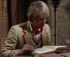
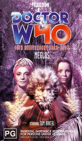
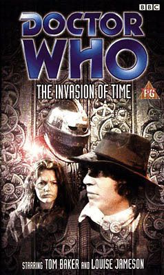
A late contender, what about "Meglos", which faithfully and lovingly replicated the photo of Tom/Meglos with his gloves half-off?
And the "Ambassadors" cover with more than three alien Ambassadors?

And "The Tenth Planet" with the lovely trees all over the South Pole?

"The Android Invasion" was so stingy with photos that it used a bit of artwork for the front, and then the same artwork cut up into sections and used to illustrate the back!
This video was lucky not to fall foul of the Trades Descriptions Act, with lucky purchasers likely to notice a subtle difference between the effects on the video and those promised on the cover:
"An Unearthly Child" had a lovely cover though, with its homage to Queen's "The Miracle" album.


This is still a thing of beauty, and just looking at it is enough to transport you back to feelings of sheer excitement. Are you ready? Go!
Si.
-
3rd Sep 2012, 11:04 PM #7
- Join Date
- Nov 2006
- Location
- Sittingbourne, Kent, UK
- Posts
- 2,403
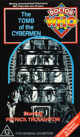
Some nice posts there. Si, I totally agree about that absolutely gorgeous Tomb cover. Do you recall it was given away as a free poster with an issue of DWM? I had it on my wall for years.
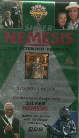
Here are some of my thoughts. I particularly liked these ones:

(Yes, I know Davison looks pretty awful in the Earthshock cover, but I love the design and the huge Cyberman's head. )
Among my least favourite covers are:

A simple and effective design, but look! They got the Daleks backwards! The arms are on the wrong sides!!! That always bugged me about that cover.

They went a bit vortex crazy for a while in the 90s, and I think this was the worst of them.
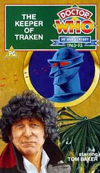
Not only is it a huge expanse of nothing with a very bad likeness of Tom Baker, a pointless pot plant and a blue Melkur, but it went all 'child's drawing' when the artist added the laser beams from Melkur's eyes!
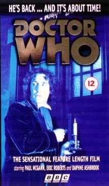
The first new Doctor Who in seven years, and we get this dull, uninspiring, not remotely seen in the movie picture on the cover.
And finally, the worst of the lot:
Badly composed, too much blank space, and sticks out like a sore thumb on the shelf with all the others.
-
3rd Sep 2012, 11:26 PM #8

- Join Date
- Nov 2006
- Posts
- 1,884
I find the very early black background, with one or two images cut and pasted onto them hugely nostaglic, I'd love to see more done like that.
-
4th Sep 2012, 12:17 AM #9
- Join Date
- Feb 2007
- Posts
- 3,610
What I seriously love about this, and covers like it, is from looking at them you'd never guess the show would be so well regarded by the BBC nowadays! Originally Posted by Jason Thompson

These covers plumbed new depths of "Will this do? Sod it!" within a department in BBC Video. They eventually got their groove "back" and even the cover for The Dominators made the story look more interesting than what it actually was.
The best use of photographs was for "Spearhead From Space". Although I haven't got a picture of that to hand. Notable mentions too for "The Deadly Assassin", "Genesis Of The Daleks/The Sontaran Experiment".
And can I get some love for the early (wrong logo) and the budget covers for "Revenge Of The Cybermen"?
-
4th Sep 2012, 1:08 PM #10
...
- Join Date
- Nov 2006
- Location
- ...
- Posts
- 4,747
Didn't Sid Sutton design the early photo montage covers?
-
4th Sep 2012, 2:56 PM #11
- Join Date
- Nov 2006
- Location
- Loughton
- Posts
- 11,582
Whoever drew Tom on this seems to have heard about Michael Bentine's interview for the part and decided he did get the part after all... Originally Posted by Jason Thompson
-
4th Sep 2012, 3:03 PM #12
 History Boy!

- Join Date
- Oct 2006
- Location
- Bracknell, Berks
- Posts
- 29,744
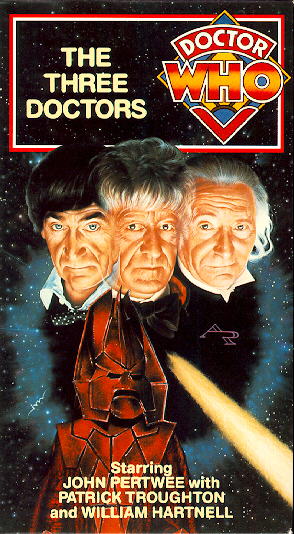
I really like The Three Doctors:
And for a late one...


I've just got my handcuffs and my truncheon and that's enough.
-
4th Sep 2012, 8:01 PM #13
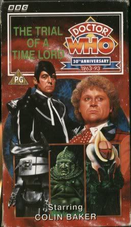
 Who is this Davros?
- Join Date
- Nov 2006
- Location
- London, United Kingdom, United Kingdom
- Posts
- 17,652
All good - but surely the worst video cover of all time goes to...

Two faces, flushed down a toilet. Pathetic!Pity. I have no understanding of the word. It is not registered in my vocabulary bank. EXTERMINATE!
-
5th Sep 2012, 12:59 PM #14
...
- Join Date
- Nov 2006
- Location
- ...
- Posts
- 4,747
What's with calling it Dr.Who? That goes against everything we hold sacred.
-
8th Sep 2012, 7:45 AM #15
Who is this Davros?
- Join Date
- Nov 2006
- Location
- London, United Kingdom, United Kingdom
- Posts
- 17,652
There are some corners of the Universe that have bred terrible evil. People who call our favourite television show 'Dr.Who.' They must be fought.
Pity. I have no understanding of the word. It is not registered in my vocabulary bank. EXTERMINATE!
-
8th Sep 2012, 3:27 PM #16
- Join Date
- Nov 2006
- Location
- Loughton
- Posts
- 11,582
Ebenezer Wallis' family pile for example... Originally Posted by Rob McCow
-
12th Sep 2012, 2:15 PM #17
- Join Date
- Feb 2009
- Posts
- 269
There was a thread about this a while back (http://www.planetskaro.org.uk/forums...ead.php?t=7198).
Among my favourite covers are The Dæmons, The Sea Devils and The Seeds of Doom. Least favourites include Terminus (yuck!), Image of the Fendahl, The Masque of Mandragora, Dragonfire, Resurrection of the Daleks and The Horns of Nimon.
-
13th Sep 2012, 12:53 PM #18
Together Through Life
- Join Date
- Oct 2006
- Location
- Sawbridgeworth
- Posts
- 25,127
Revealing that Si just copied his reply from one thread to the other. Bah!
Unless he is freakishly consistent, even down to his wording.
Si.
-
13th Sep 2012, 1:03 PM #19
History Boy!
- Join Date
- Oct 2006
- Location
- Bracknell, Berks
- Posts
- 29,744
I'm freakishly consistent with my copy and pasting

I've just got my handcuffs and my truncheon and that's enough.
-
13th Sep 2012, 3:12 PM #20
- Join Date
- Nov 2006
- Location
- Loughton
- Posts
- 11,582
Any librarian will tell you that it sometimes helps to have multiple copies...

-
13th Sep 2012, 6:05 PM #21
...
- Join Date
- Nov 2006
- Location
- ...
- Posts
- 4,747
And a damn good pasting.
-
14th Sep 2012, 2:28 PM #22
- Join Date
- Nov 2006
- Location
- Loughton
- Posts
- 11,582
Well we keep that part to ourselves - otherwise everyone would want to be one!
-
3rd Aug 2013, 9:51 PM #23
 Orchestral Wagnerian
- Join Date
- Apr 2010
- Location
- Melbourne
- Posts
- 3,457
My nostalgia for the old VHS covers compelled me to get rid of the roundels. I just love that classic font.

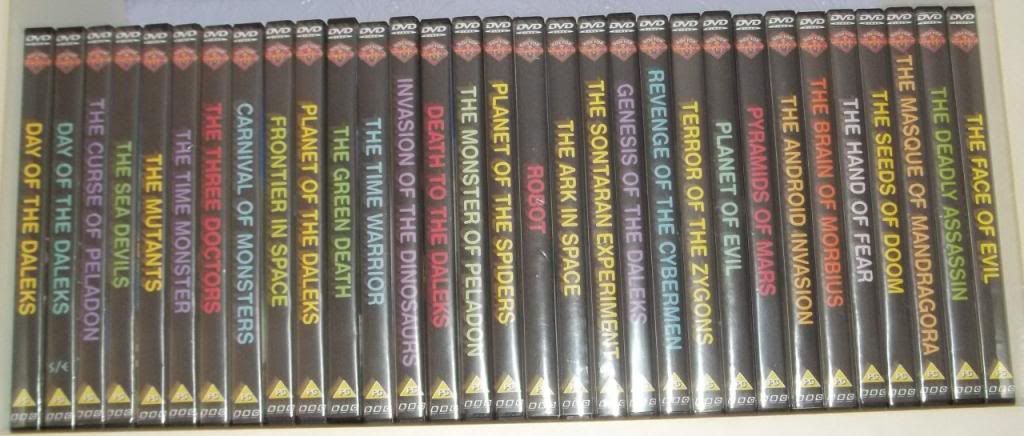
I'm lazy though. Look.... They're all PG.

-
3rd Aug 2013, 10:46 PM #24
Absolutely splendid!
- Join Date
- Oct 2006
- Location
- Downstairs by the PC
- Posts
- 13,267
Now that really is dedication to duty. I particularly like the Dalek-y font on the "S/E"!
-
4th Aug 2013, 5:40 AM #25
Who is this Davros?
- Join Date
- Nov 2006
- Location
- London, United Kingdom, United Kingdom
- Posts
- 17,652
I do hope you've got the colours right, Wayne.
Pity. I have no understanding of the word. It is not registered in my vocabulary bank. EXTERMINATE!


Similar Threads
-
Cover Of The Day
By MacNimon in forum Picture GalleryReplies: 467Last Post: 24th Dec 2015, 12:35 PM -
Good Cover, Bad Cover
By Paul Monk in forum MusicReplies: 17Last Post: 27th Sep 2009, 9:54 PM -
PDA Cover Competition Group 20
By Paul Clement in forum The Fiction FactoryReplies: 8Last Post: 9th Jul 2007, 6:50 PM -
PDA Cover Competition Group 19
By Paul Clement in forum The Fiction FactoryReplies: 8Last Post: 27th May 2007, 4:13 PM -
PDA Cover Competition Group 18
By Paul Clement in forum The Fiction FactoryReplies: 11Last Post: 15th May 2007, 2:46 PM


PSAudios 6.1. Bless You Doctor Who
[/URL] (Click for large version) Doctor Who A thrilling two-part adventure starring Brendan Jones & Paul Monk & Paul Monk Bless You,...
23rd Nov 2020, 3:02 PM